Sometimes artists get so hung up on technique that we forget to tell a story, express a moment or reveal something intimate — all things great art should be.
To me, this “revelation,” as it were, is the most important and most difficult aspect of art: How to infuse are with meaning.
I recently had the wonderful opportunity to be part of the Nasty Women Exhibition in Northwest Arkansas. The event is apolitical, but there were so many intimate images of how women related to the term “nasty” or how they feel as women generally. It was a beautiful event. My part — a show at Local Color in Fayetteville — ended Sunday, but the events will be going on all of this month.
On Saturday, women gathered to talk at a forum. The panel spoke about art’s ability to challenge viewers and pointed out how so many women feel unheard.
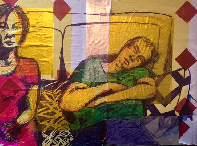
My piece, “Relationship Goals,” went up Thursday with an artist reception. Only one person “got it” immediately. I put it on here and hope you “get it” too.
This image is something that actually happened and probably happens to every couple. (Yes, the woman’s expression is tired-angry.) I used regular colored pens and markers to achieve the effect. The paper, though, is a collage of “joss” paper, also known as ghost or spirit paper. I picked up a bundle at Tang’s Asian Market not too long ago.
What interested me about the paper (aside from its vibrant metallic essence and repeating patterns) is that it is used traditionally as a way to pay off ancestor debts, among other family-related things. It’s burned as an offering. That link to family, even when we don’t want the link, seems inescapable in life and even death. How much of what we do is just a repeat of what others did before us?
For some who attended the show, this made an impact.
“The worse thing I ever did was try to be someone else,” a patron said Thursday.
“Yes, but someone told you not to be that person, didn’t they?” I said.
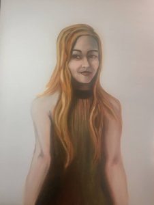
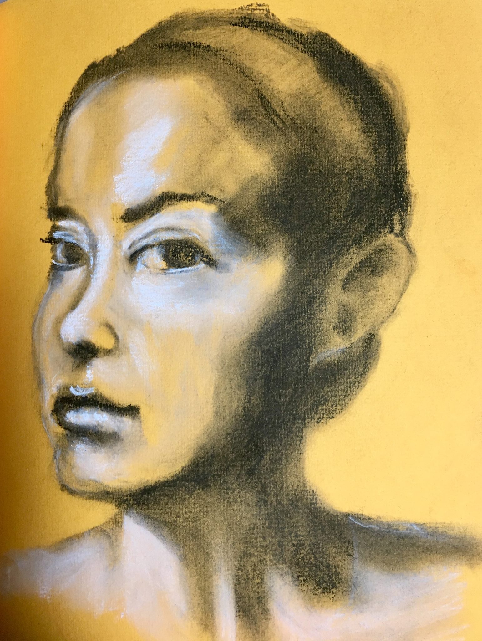
Venetian red and viridian green were used for the dress, skin and shadows (Rhea’s Daughter.) Some classical artists use only two colors (with black and white) to create an entire portrait.
The red and green with white makes a nice creamy peach color. I was surprised that no yellow (Naples or Ochre) was needed to make the flesh appear natural.
However, I was forced to break out and use yellow ochre anyway to achieve the blond hair. I tried mixing different varieties, but I could achieve only brunette with the palette. (Next time I do this, the model will be dark headed.)
I then used the red and green in the hair to add texture, shadow and keep continuity.
I am pleased with the result.
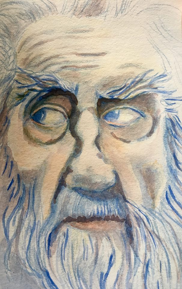
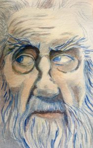
I took the same theory and applied it to a watercolor portrait.
“Russell Sims, Titan,” portrait in watercolor, 2017
In this painting, I did the initial drawing with a blue draftsman pencil. I then mixed an earthy red (as close to Venetian red) with a yellow ochre and diluted the pigment so I could do washes. I then added blue back to the palette for shadows and eyes.
This painting happens to be my grandfather, who has stunning blue eyes and white, white hair. He also was a country and gospel music icon.
Plus, I was able to keep the work traditional: No white was used.
By limiting my colors, I was able to create more cohesive portraits. I love how the entire painting draws upon itself and repeats colors as though it is poetry.
As a reporter in Northwest Arkansas, I get a front-row seat to history… but also I just go to a lot of meetings.
These gatherings give me a great opportunity to sketch out what I am seeing. I make sketches of county and city department heads, government leaders and people attending meetings. I make a sketch of someone — even other reporters — at least once a day.
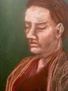
Washington County Planning Director Juliet Richey waits at the Quorum Court. Pastel. 5 by 7.
Making a series of quick sketches helps me concentrate on what my sources are saying, but it also helps me improve my drawing and basic art skills.
Sketches can be more difficult than fully formed paintings. They require a massive amount of quick observation — something reporters strive for, too.
To the left, I sketched a department head as she waited in the Washington County Quorum Courtroom in Fayetteville, Arkansas. The sketch is done in pastels and layered with soft pinks.
I was looking for color and tonal consistency in piece, so I repeated the colors often. Notice the color in her hair is also in her lips and downcast eyes. You can also see that the green I used as my base sketch is evident in her hair.
In this portrait sketch, I attempted to capture the dramatic lighting from direct overhead lighting in the courtroom. The effect came out similar to chiaroscuro, where there is a strong contrast between the illuminated and the shaded areas.
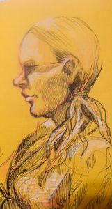
To the left, below “Juliet,” is a sketch of another Quorum Court attendee, Lanie Miller. This sketch is a little different because it includes ink.
The county attorney’s legal assistant is rendered in pen first and then highlighted with a light pastel. 5 by 7. Sketch.
Again, this subject interested me because of high contrast. Her blond hair and skin became extremely highlighted by the florescent lights overhead.
Miller is a regular attendee at county government meetings, and she has interesting features I don’t often see. That includes a very lovely sloped forehead. I tried to capture both the dramatic light and interesting features in her physical form and body language.
Other times when I sketch, I use only ink on Reporter’s Notebook.
Below are two examples of this technique, where I am learning the features and trying to capture the movement. None of my subjects are still for very long because they rarely know I am sketching them. These sketches must be fast, up to 5 minutes tops.
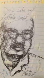
Washington County Fire Marshal Dennis Ledbetter attends planning meetings and advises on safety. Ink on “reporter notebook.” 2016
To the right, the county fire marshal attends planning meetings to talk about visiting sites that plan to develop and talking about safety needs.
In this rendering, I drew Ledbetter in ink over the top of my notes. To me, this is a sign of a true sketch. The work is very lose and starts by defining the planes of the face.
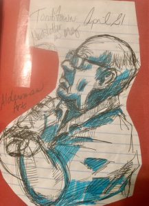
Two other examples (below) are from my time covering Tontitown, Arkansas.
Ink and highlighter sketch of Art during a Tontitown meeting. 2015
I sketched Alderman Art Penzo on “Reporter Notebook” paper and then cut the image out of my notes. I then simply took a blue highlighter from my bag and used it to darken the shadows I had sketched out.
If you look closely, you can see that I had started sketching a different alderman and then switched when Art began became still during the meeting.
Art has an interesting way about him and that is what drew me to sketch him. He is intense but thoughtful, and I believe this comes out in the sketch.
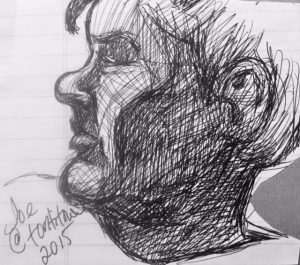
Former Alderman Joe Edgmon during a meeting last year. Ink on notebook. 2015.
To the left, I used hatching to create a dramatic contrast on Joe Edgmon, who was a Tontitown alderman in 2015. Joe also has an interesting profile that is different from most of the people with Italian heritage living in Tontitown.
This sketch is also done on Reporter Notebook paper.
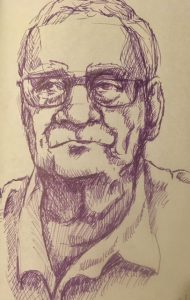
Lehman, purple marker on pastel paper, 5 by 7, 2016.
To the left is one of my favorite quick sketches. This one actually is longer than 5 minutes, so I had time to concentrate on the expression and deep shadows.
Lehman, 78, is done in purple marker on pastel paper, 5 by 7 inches. He is probably one of the most interesting people I’ve met, and I attempted to capture that nostalgic gaze that crosses his face often.
The key to good sketches is to just continue to sketch. I have hundreds of failed sketches. But, I can’t resist the next challenge. I look at the planes of the face, find out why I am drawn to the subject and then just… sketch.
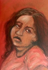
A girl waits with her mother at the DMV in Fayetteville, Ark. Pastel on 5-by-7 paper. 2016
I carry a Fabriano journal everywhere I go and managed to capture this quick study of a young girl at the DMV. I used my cell phone to snap a photo (it wasn’t the best photo) and used that to fill in some more detail. I really like this kid’s expression because we all felt this way while trapped at the DMV.
These are highly concentrated pigmented pastels. I also sometimes work with hard pastels or mix the two. I find soft pastels deliver a higher-quality color saturation. I love color and experimenting with color. I was originally drawn to this child because of her bright shirt and dark hair.
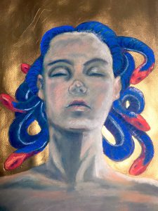
Below, is an example of hard and soft pastel used together with a gold acrylic background. You can really see the vibrancy in Medusa’s snakes — soft pastel. I painted Medusa’s skin first with hard pastels in green shades. The technique is one used by artists like Degas. You can see some of the green in his underpaintings.
I also saw this technique used at the Savannah College of Art & Design, where students used variations of green first to catch a certain effect.
Medusa, Malaysian Coral Snake hair. Pastel and Acrylic
I chose Medusa because she has such an interesting background. She was a beautiful maiden who was treated unjustly and turned into a monster who became feared by men. Her image was at one point adopted by feminists.
I chose the brightest snakes I could and reproduced them here. They are Malaysian Coral Snakes — highly poisonous, which I thought was fitting for Medusa.
Both of these pastel examples (the girl and Medusa) strive to capture a certain meaning using a very vibrant and difficult media. With Medusa, I was shooting for symbolism. With “Girl at the DMV,” I wanted to show emotion and life.
I believe art is an experiment. Every time I sit down at my easel, it’s an experiment. Even so, art should say something. To me, art should be more, than “Art for arts sake.” It is meant to bring us closer to beauty, emotion, society and ourselves.
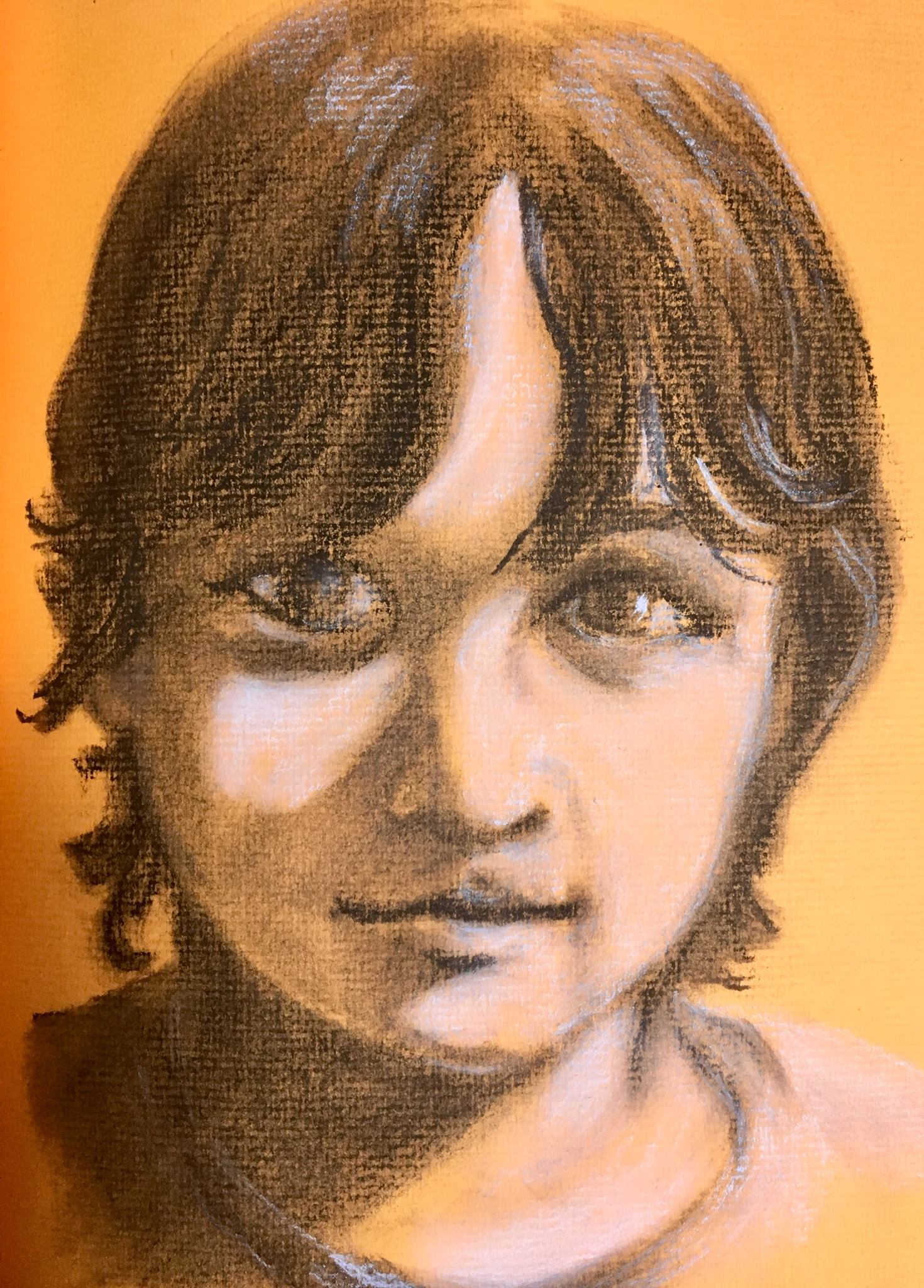
Charcoal is a versatile media that is great for capturing expression and mood. Here, I experimented with a portrait of my little brother on pastel paper, 5 by 7 inches. The portraits are great for affordable gifts.
Black & White Charcoal on Fabriano colored paper, 5 by 7 inchesCharcoal on Fabriano paper